United Nations Convention to Combat Desertification: Rebrand

GMD graduate Beth Johnson has just finished working on a challenging brief for the UN as the result of a live college project that ran last year. For the rebrand, she was solely responsible for research, strategy, design, copy and brand implementation.
Brief: Rebrand the United Nations Convention to Combat Desertification to strengthen the positioning of the organisation and better communicate to external audiences the importance and urgency for land protection.
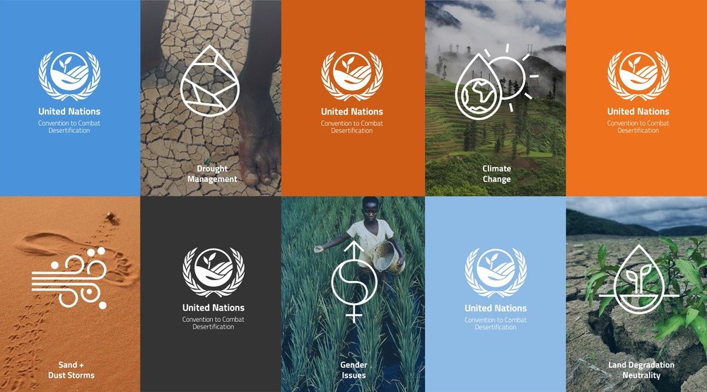
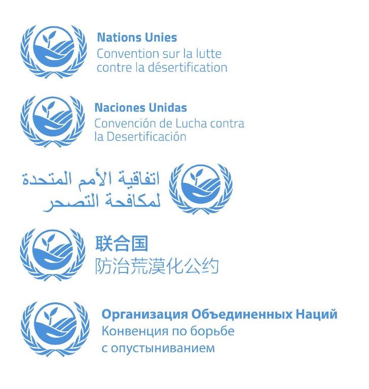
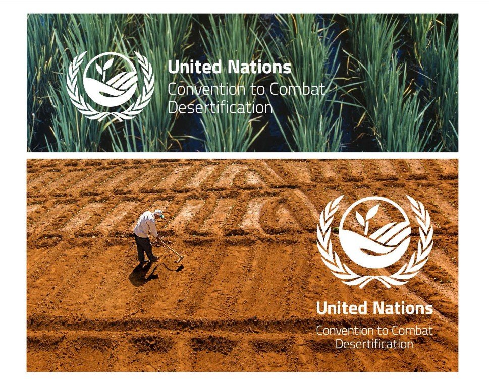
Solution: An identity which utilises the authoritative visual language, colour and style of the United Nations family. A marque which encompasses the key visual elements of the convention: land stewardship, human presence, hope, progress and life in a circular form symbolising an inclusive convention with global reach.
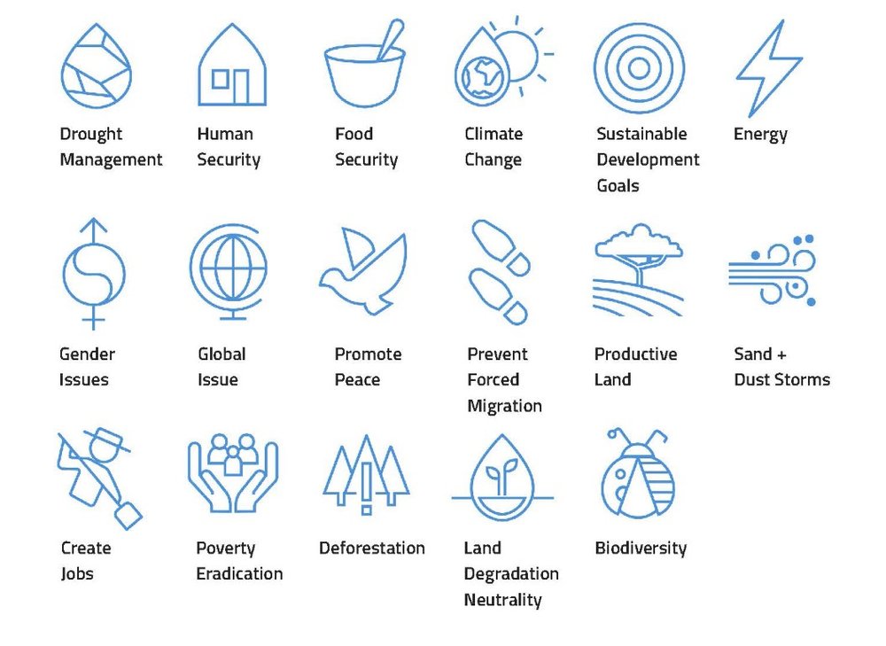
Impact: The branding will be used for the next few decades, on all public and internal work, appearing alongside other more well recognised identities at UN conferences and publications. The new aesthetic is unified with the wider organisations branding but is not uniform. The new symbol instantly represents a global organization offering a consistent level of successful sustained action to protect land.
This was an amazing opportunity for Beth, especially implementing the resulting scheme – an interesting challenge in an office where they don’t usually have designers. But she thinks that the convention now visually feels a part of the UN family as a whole, meeting the aim to gain respect and show the convention’s authority in its field.
http://www2.unccd.int/news-events/new-corporate-logo-launched
