Type Designer Takes Next Step

Alumni Matthew Willsone is preparing to start an MA at the University of Reading, specialising in typography. He shares his story with us…
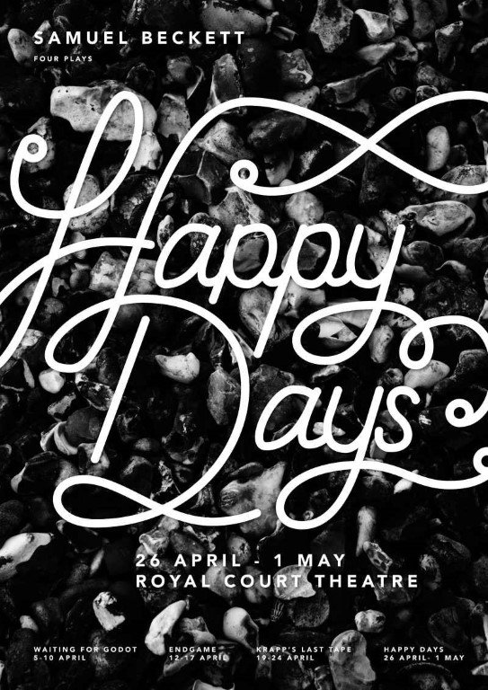
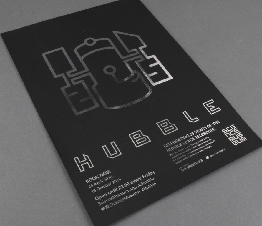
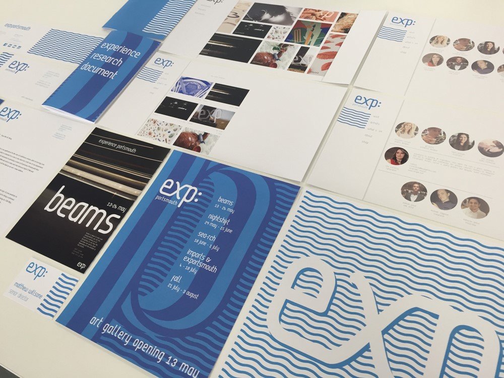
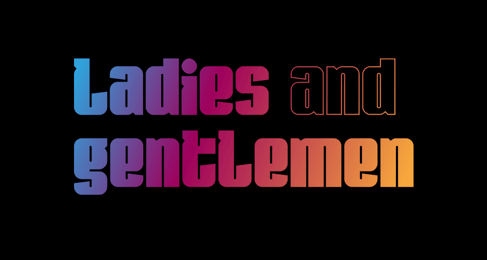
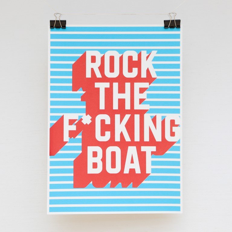
“During the latter months of studying Graphic and Media Design I wanted to challenge myself to create work that was completely original, which meant developing a unique style of type design for every project. Making this choice and putting in those extra hours really enhanced my experience of the course, my standard of work, and ultimately, my grades.
A problem I faced after starting full-time work was that there simply weren’t enough hours in the day to develop type for my projects, or myself as a type designer. For most graphic designers that would be a minor quibble, but for me it was a big deal.
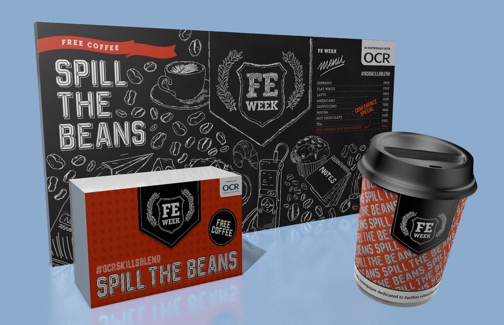
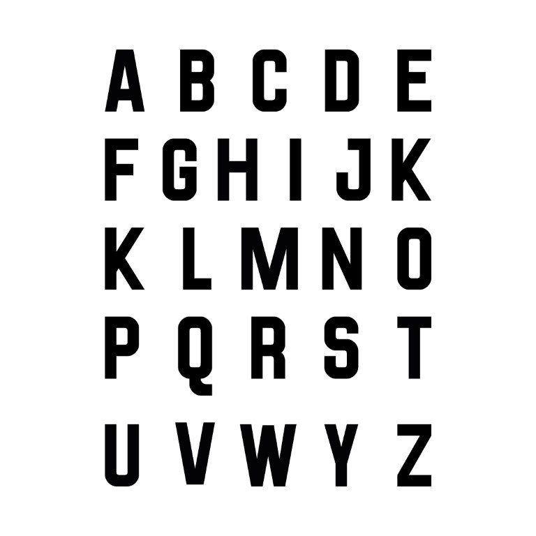
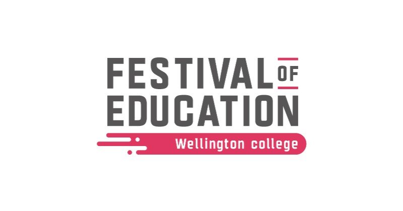
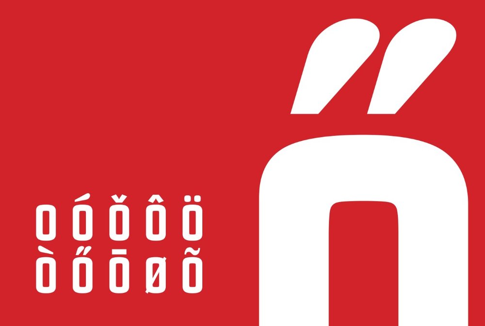
In my almost two year period at LSECT (the publisher of national education weeklies, Schools Week and FE Week) I got the opportunity to develop a typeface once. The company was running a coffee stall at a major education conference in 2016. When designing the stall and coffee cups and assorted other merchandise, I was instructed to use the typeface Bebas but, I’ll be honest, I hated it. So I took it upon myself to develop a semi-condensed bold typeface – Fervour Sans. I kept the grid and rules basic because time was limited, but it worked and I was proud of it.
…I started using my daily commute to sketch and develop type and immerse myself in the world of typography.
This experience triggered a domino effect and I started using my daily commute to sketch and develop type and immerse myself in the world of typography.
Initially it was a slow process. I was practicing for just over an hour a day, but over the course of a year I had designed a whole typeface and found the time to completely rebuild it from the ground up not once, but twice. It was during this time I taught myself the basics and got comfortable using Glyphs App.

My first typeface, named Class-357, was heavily influenced by my commute. The letterforms themselves were bold with very closed apertures, and reflected my journey – densely populated and crammed.
I closed the project to resume working on what I later named Fervour Sans. I expanded the typeface that I used to make the coffee stall branding at the education conference, taking it up a notch from 30 glyphs to 250. It was at this point something really clicked, and I felt like I needed to be making more of an effort to hone my career path and give my full focus to pursuing a career path as a full-time typeface designer.
I sent emails to various foundries around London and set up a meeting with Ed and Anthony from Colophon. It was a great experience to get their feedback on my work, and one of the biggest things I took away from the portfolio review was that I still have a lot to learn before I’m going to be in the position I want to be in. I have an appetite for it, but lacked an effective platform for learning the relevant in-depth specialist knowledge.
I had been toying with the idea of pursuing a Masters since finishing my BA in 2016, but it wasn’t until now that I felt that it could be a dealbreaker in carving out a successful career in the industry. I therefore applied, and was accepted, on to the University of Reading’s MA Type Design this year. I’m incredibly excited to undertake this opportunity. Two years of slowly grinding has left me hungry to learn more and grow as a designer. I feel that I have a lot to prove to myself and intend on making the most of the time that I have.”
We wish Matthew all the best on his MA!
Links:
Website: http://matthewwills.one
Instagram: Matthewwills.one
