New work from MuirMcNeil

Paul Klee famously said that drawing was “taking a line for a walk” but nowadays we exercise dots in the same way. Sophisticated software programmes trace our smallest ideas and gestures in intricate arrangements of binaries, off or on, on or off. These cluster tightly together in massive formations, hiding in plain sight to create spectacular illusions of images, words, movements and sounds.
MuirMcNeil’s new typographic projects are attempts to harness the dot by amplifying it at the same time as diminishing it to the lowest possible pitch; to the tipping point where it can no longer act as a carrier for any message except to communicate its own isolation. Referencing the earliest, crudest implementations of these binaries in pixels and dot matrix printing, MuirMcNeil’s intention is not to wallow in technological nostalgia but to simply expose the inky dot to hard white light; to pin it down, black and raw.
These points have remained feral: they have not been wrangled into domesticated herds but have been left alone as separate organisms. In the patterns they make, it’s possible they might pick a fight with the ones on your screen or they might gang up to attack an older, weaker postscript print device. It’s up to you to tame them. Handle them with care, like a swarm of killer bees.
Typefaces and posters
There are four typefaces within the system, each available in extensive variations and subcomponent versions which can be used for the development of unique design outputs.
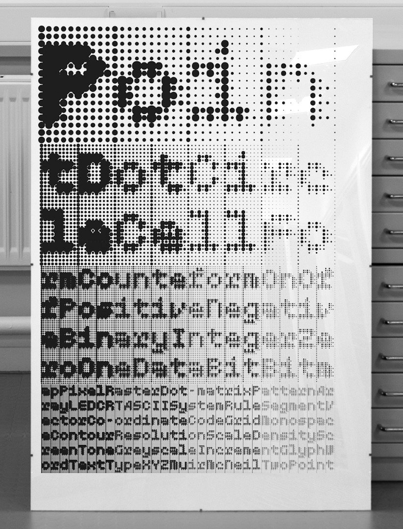
TwoPoint is a monospaced geometric type system based on early dot matrix and LED display lettering.
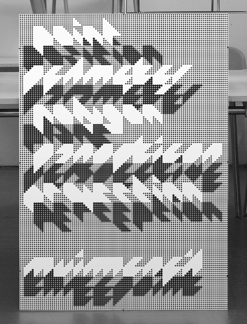
ThreePoint is a system of three-dimensional display typefaces designed in four viewpoints or projections.
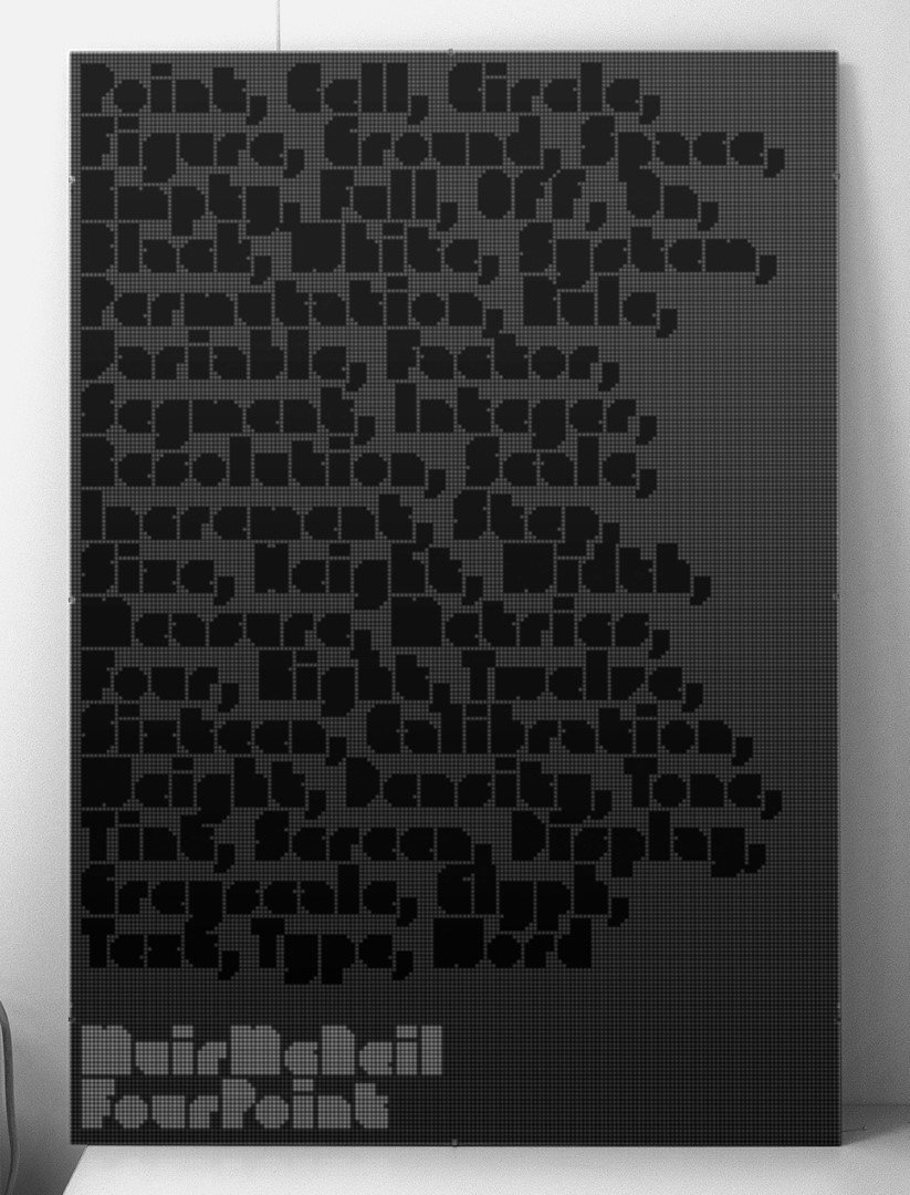
FourPoint is an optical/geometric type system that explores the relationships between scale, density, information and resolution.
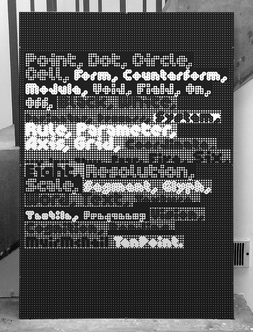
TenPoint is a modular type system that attempts to locate typographic objects at the lowest limit of their function as vehicles of communication; to use the fewest dots.
The typefaces in each system are designed to interact with one another in layers, offering a wide range of visual opportunities when working in print and fixed media. They are also particularly effective in motion graphics where their precise calibration allows perfect control over positions and transitions.
A limited edition of four large-format silkscreened posters has been published in glorious black-and-white to accompany each typeface system. MuirMcNeil’s website, www.muirmcneil.com, provides extensive information on their design background and development. Typeface licenses and posters are available for purchase at www.muirmcneil.com/shop.
info@muirmcneil.com
www.muirmcneil.com
twitter: @MuirMcNeil
