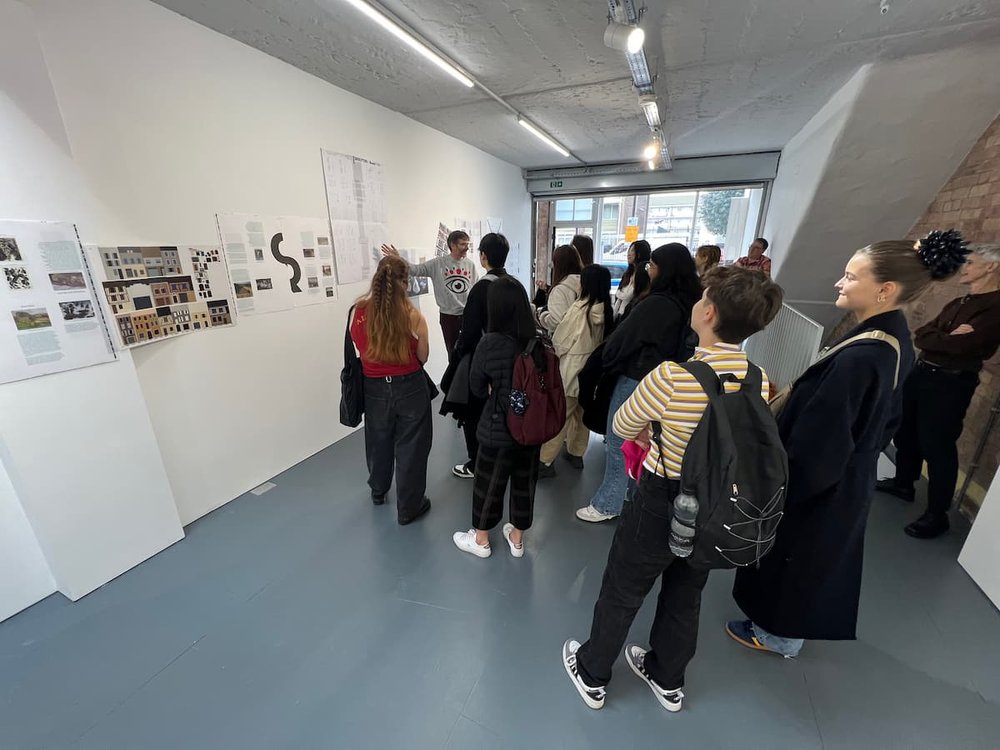
Imposed Alphabet, Fraser Muggeridge

Imposed Alphabet, Fraser Muggeridge studio: No Show Space 13 – 21 October 2023
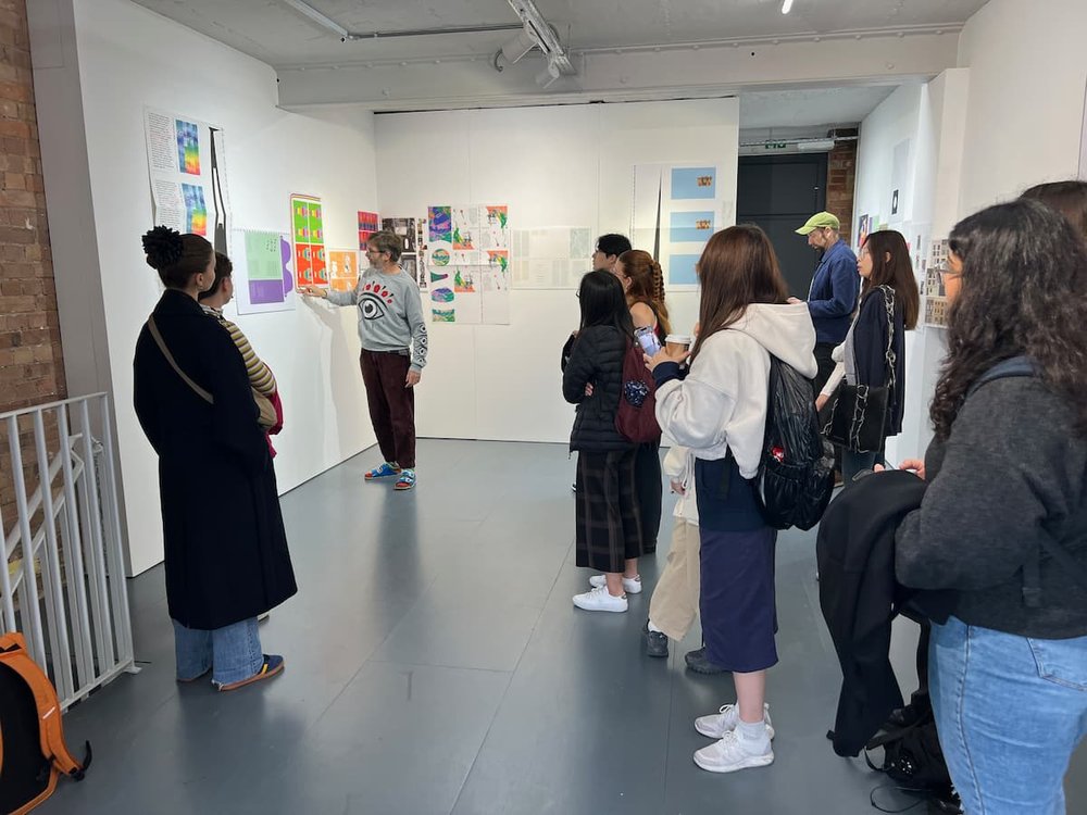
Fraser Muggeridge met GMD students at No Show Space gallery in Bethnal Green, London to discuss his work Imposed Alphabet
noshowspace.com/exhibition/imposed-alphabet/
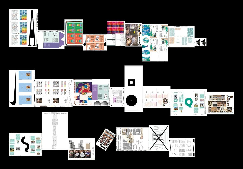
Imposed Alphabet consists of letters concealed on imposed printing sheets from various jobs designed by Fraser Muggeridge studio from 2018 to 2023. The shape, size, colour, and material of each letter refer to the design of the sheet that hosts it. Imposition is the process of arranging pages onto a printer’s sheet for maximum efficiency. Correct imposition minimises printing time, simplifies binding, and, by maximising the number of pages per impression, reduces paper waste.
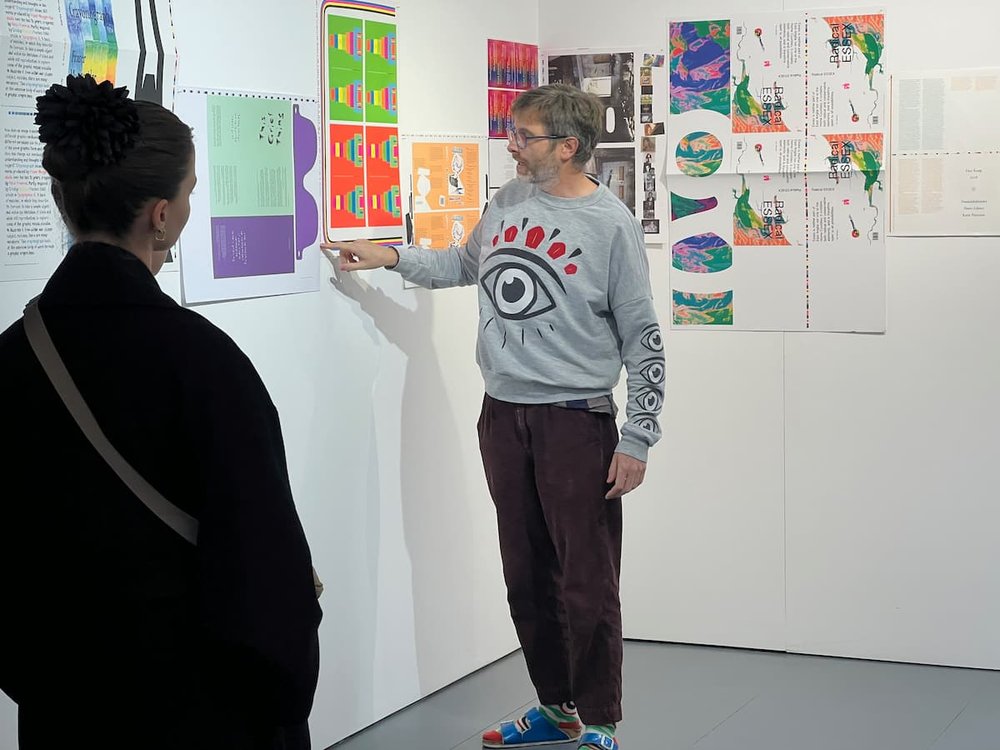
Fraser toured students around the show, an exhibition of 26 imposition sheets which chronologically spanned from A-Z, from 2018 to 2023. He talked about his process, and how each letterform was created.
Transcript from the talk by Fraser Muggeridge:
“Papers and presses come in slightly different sizes and shapes, depending on what the job is. Depending on what the printer is. Depending on what size their setup is and, when the job is printed, the artwork that we give them is imposed on a big on a printed sheet, hence the word imposed alphabet. That process is called imposition, which I always think is a great word, cause imposition means something else in English, doesn’t it? You’re sort of imposing on something.
It’s a weird word, I’ve always loved it, and obviously when things are imposed, 99.9 times out of 100, the designer is unaware of what that process is. Really you don’t really need to know, however, when you go to a printer and potentially do a press pass, checking it on press I always used to go ‘ohh there’s a bit of space there’, like there’s a bit of space on the side. Bit of space because obviously depending on your format of your publication and the format of the sheet, there might be some spare space. So I sort of always thought I suppose for a long time, I really want to put something on the space.
Sometimes I might put a little free business card, or a little postcard for a friend. And then I suppose I thought, what happens if we start putting letters in the spaces and see if we could make an alphabet?
So we started in 2018 with the A. Of course [pointing at the imposed sheet with the A] that’s a B1 sheet which is 100 by 70 [cm]. So there’s a lot of space. So I had the opportunity to put stuff on the on the sheet and of course that comes with lots of problems, because trying to explain it to a printer is really hard. They’re like, well, why do you want that? We’re just gonna chuck it away. Like why?
The idea was actually to make individual letters. This is how design works through, so the original idea was that we would be sent 300 of these and then. Then, because I love the flat sheets, the imposed sheets became kind of more important to me, which is why there’s two versions. And that’s why on the wall, you actually got the original flat sheets. What it’s sitting next to in a way, that’s as important. The other thing to think about is the letter form relates to either the same project or what else was going in the studio.
A: So for example the A, we were also designing another book for Hayward Gallery. They used this weird chunky typeface, so I really love this spot we made, I just thought put a big A on it and I didn’t really think about it that much?
B: The B was some sunglasses for an exhibition design for the Science Museum. So that kind of got lifted.
C: Then we sort of started thinking and getting a bit more radical. So you’ve got registration marks. And colour bars and they’re both printers marks. I’ve always loved them. You know, people love them, right? This is just like printers mark just kind of has gone crazy. It’s like a seed. So this one was, cut off here. We got a bit more elaborate where they couldn’t actually send us the flat sheets. Is there’s no way to? So then I was like, well, send me 100 flat sheets. So I think that’s where I got more interested in the flat sheet than the cut off sheet.
D: The challenge was always that before the job went to press, we would ring up the printer and say ‘have you got any room?’. Sometime it would be no, sometimes they will be like, yeah, we have. You’ve got 100 by 50. We would have like half an hour or an hour to go right? So we need to make D, sometimes they’re very basic like this. This is made out of the same size sheets, same size design, so that is that and that is that and that is that [pointing at elements in the imposition] so we used all the elements of here to construct two Ds.
E: It’s really radical because that was so hard for the printers to impose because we were trying to put the E like in the artwork.
F: The F was just actual size bits from the inside the book.
G: The G was because… Has anyone been to Farringdon Station? Yeah? And seen the Edward Johnston memorial. Next time you go to Farringdon Station, quite a big station, there is the Edward Johnson memorial that I designed that has massive wood letters. So the G is that.
H: The H is like again a bit like the E, but even more. So the H, all these ones [pointing at previous letters] were kind of designed by us, whereas the H was the first time we got the printer to do it, because we didn’t want it designed, that’d be too hard, that’s their marks. And we didn’t know the parameter. So we said to the printer can you just put a line on the end of the sheet, and then that becomes the H.
I: The I looks a bit like a camel, but this is actually an invite for Focal Point gallery, that’s die cut. The I is the size of the vinyl that we also produced for same gallery.
J: The J was this was for Nike. So we were just lucky, we was like, let’s just make a big stretched J.
K: The K was all the captions from a catalogue for Ron Nagal arranged to look like a K.
L: The L was, I got really into this sort of Photoshop content aware fill. Have you ever done content aware fill where it goes a bit wrong? So we started getting this and it became an L.
M: The M was again the same typeface blown up.
N: The N again was similar to the C which kind of goes through the typeface. That goes through the artwork. So this is the cover it goes through.
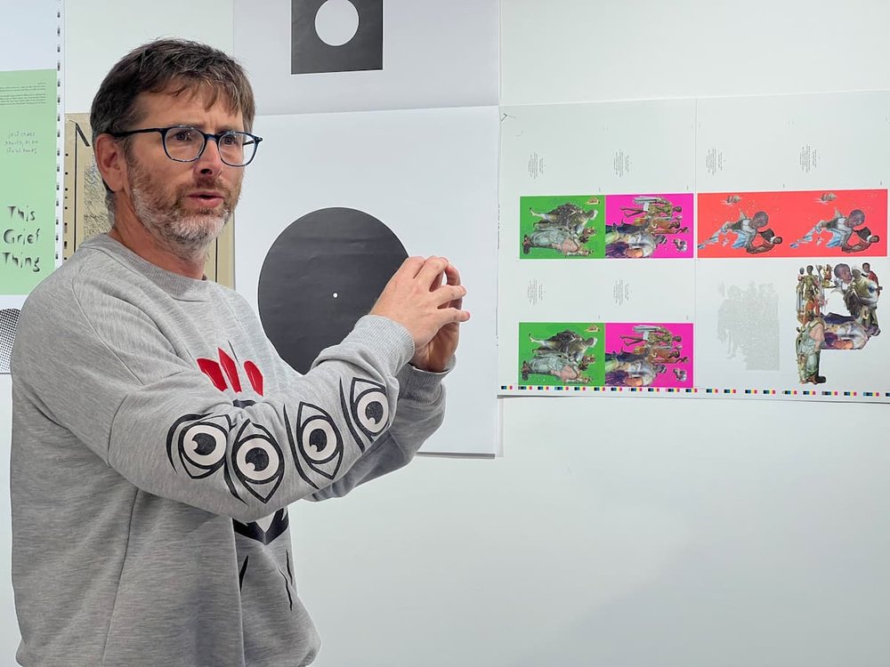
O: We produced a journal called Inscription and the client is very wasteful in his paper and we had so much left. The first issue of inscription came with a 12 inch record and a 7 inch record. Of course they’re both like Os. So we just did 2.
P: The P I’m very much into this idea of, obviously, size. Like one to one scale. So the P was all these elements mashed up together to make a P.
Q: The Q is interesting because the Q was printed on a printer with a smaller press than this. So we put one of the Qs on one side, one of the Qs on the other side and then joined them together.
R: The R is a Julian Opie (who’s an artist) invitation for Pitzhanger. So we’re using the elements. Or some of the elements. I can’t actually remember. There’s always like a system!
S: The S I really love. It’s almost my favourite because the S is the same artwork as the art, as the Q because the S was the reprint of the catalogue that we made for John Nash. So this happened in May [pointing at the imprint with the Q] and then in July we needed to reprint it. So I thought I’ll need to do another imposed alphabet. So it’s the Q, but just sort of rearranged.
T: The T again is this is the artwork. So we’re falling in and it’s made-up of actual size bits of text, so it’s the same idea as the K.
We kind of run out of ideas after a while, just want to finish it!
U: The U is the same idea.
V: The V Stanley Picker Gallery at the University of Kingston, here we had a really weird space. So we put the V from the typeface they used, but we kind of messed it up so it fits the space, it’s actually printed like that.
W: The W is a kind of constructed, so sometimes it’s a typeface like the Q and the S, sometimes we make up the typeface or the letter form. So for example, the W fits the space of the sheet again of imposition, which is then a kind of a embedded bit of artwork from the insides of the journal.
X: The X was again, erm, we did the design for a box for a journal and kind of at the last minute they decided that they didn’t actually have enough money to print it. So that’s why there’s an X over it. So we printed it on the side of the sheet protest. So we made a really nice box, but they didn’t actually print it.
Y and Z: The Y is stretched letters from the inside of a little book that we did and we just thought we’re so desperate to finish it we are going to do a Y and the Z. So the Y and the Z are stretched versions you know, and you can just stretch, stretch things so they were normal typefaces.
And of course it becomes like a kind of weird kind of font, sort of unusable font. You can download the font, it’s free. You can use it in your projects. It might be very illegible if you start setting hospital signage in it, I wouldn’t advise, but you might want to mess around with it. And then of course the installation you probably worked out that it’s aligned to the baseline. So of course that’s again, a system of alignment.”
