Dyslexia Font featured on CNN News

Typographer and designer Daniel Britton graduated from GMD in the summer of 2014 and his graduate work is still finding an audience across the world.
This summer his typographic work was featured live on American CNN news and also on the station’s website.
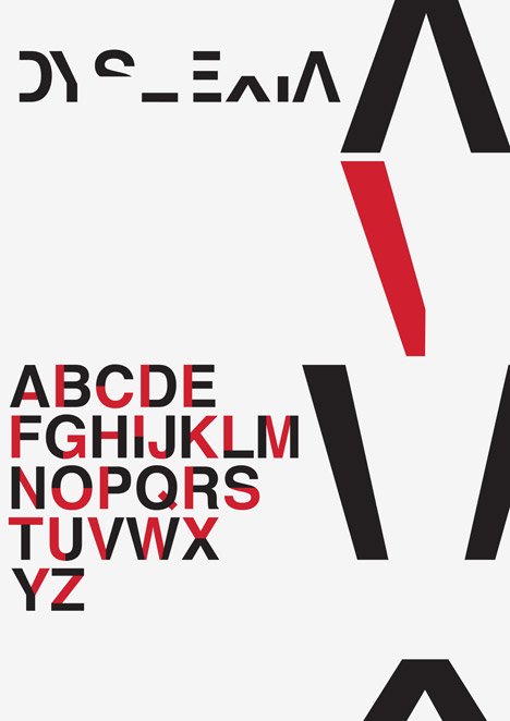
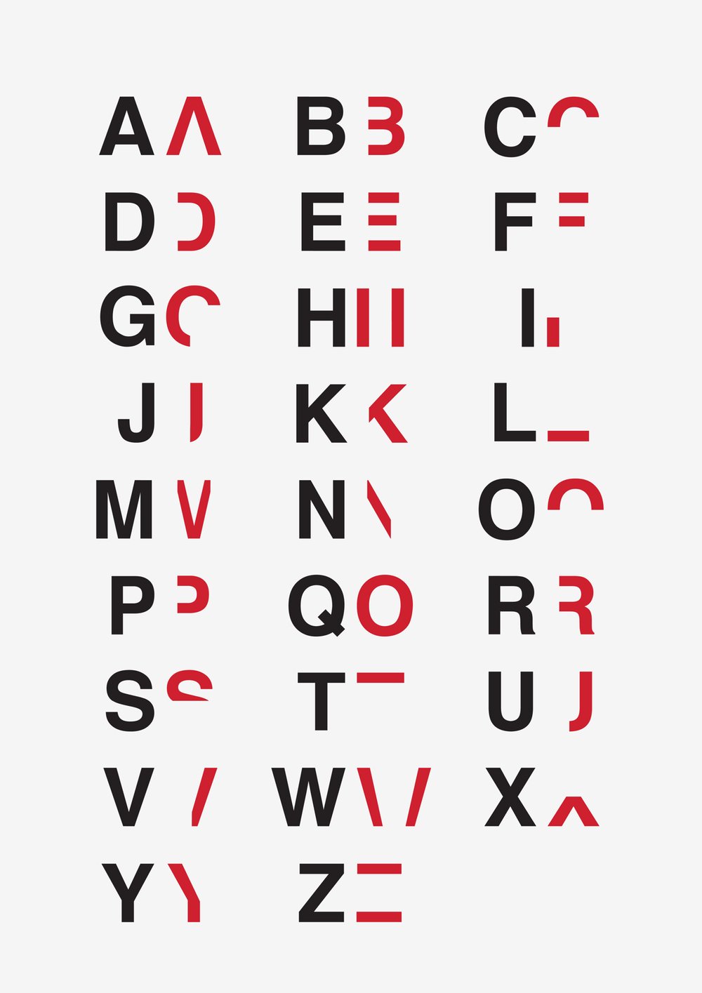
LCC Design graduate Daniel Britton – was diagnosed with dyslexia while at UAL – wanted to create a typeface that would demonstrate the effects of the disorder, which impairs reading ability. Dyslexia is estimated to affect 10 per cent of the world’s population, according to UK charity Dyslexia Action. He sliced up the commonly used Helvetica typeface – created in 1957 by Swiss designer Max Miedinger – to delete 40 per cent of each letter and number, removing their key characteristics but leaving enough to make them just about legible. The project began as a self-initiated graphic design assignment during Britton’s studies at the London College of Communication, for which he decided to apply his experiences of dyslexia to help others understand some of the symptoms. He explained that serif fonts are the most difficult for him to process, so he avoids reading newspapers entirely. However larger type and letters with curved elements, like the much-loathed Comic Sans typeface, are easier. “When I was younger, I remember Comic Sans being friendlier to read even though its a crap typeface,” Britton said. “Anything with a nice curve is better.” This turns appreciation of font design on its head ! His tutor showed the project to a member of the UK Parliament, and the designer hopes that the government will use it for various applications to raise awareness about dyslexia. “I’d love to get it developed some time soon because I really think it could help so many people”
Britton said.
“I am delighted that people are still talking about my graduate research work. I have created a typeface that recreates the feeling of reading with Dyslexia. I decided to tackle the problem with Dyslexia because I feel that it is greatly misunderstood and often poorly expressed and communicated. In Europe and America there is no sense of understanding or empathy from non Dyslexics. What I attempted to do with this typeface is slow down the reading pace of the person that is reading it, thus recreating the feeling of frustration and embarrassment of reading every day type to everybody. I want to keep this work in the News.”
Link to CNN News:
http://edition.cnn.com/2015/06/17/living/dyslexia-graphic-design-typeface-daniel-britton/ http://www.danielbritton.info/195836/2165784/design/dyslexia
web // www.danielbritton.info mobile // +44 7454322237


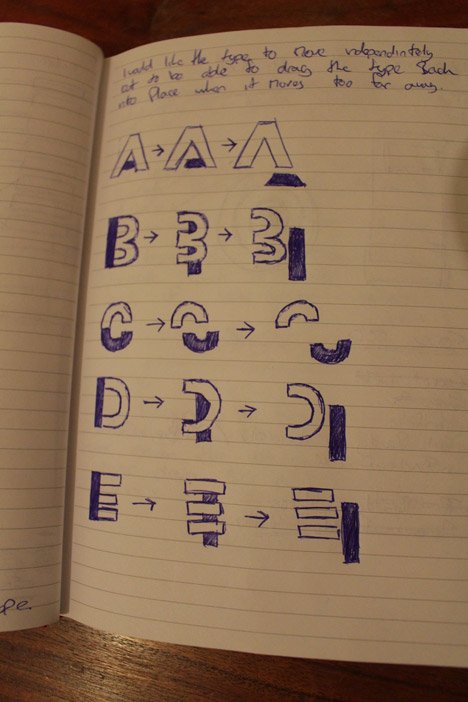
Daniel's Sketchbook
