Critical: Politics, Design & 2017

GMD alumnus, Michael Oswell’s Ibiza Mykonos project was recently part of the Beazley Designs of the Year Exhibition at the Design Museum, it was selected by Ben Terrett and one of 100 featured designs.
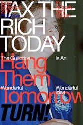
Michael created a series of political posters for the social media age. He pokes fun at the huge gap between political rhetoric and how people typically speak on the internet. The posters, out of necessity, exist as preprint screenshots. They were rapidly assembled according to a loose template, assigned a title, a format, a speculative print process, and were then sent out into the wild of the internet where they are left to sink or swim.
“It was 2017. The entire country was fucked, you and your friends are all fucked and are being collectively gaslighted by the wolf-eyed replicants in power – being told again and again that to want a dignified life for oneself and others is to be a naïve falafel-and-croissant-munching snowflake. There is no housing crisis. It doesn’t matter that you can’t make rent or get decent paid work. Benefits lead to idleness. Everything is Great (Britain™), and they’re going to make it even better; by consolidating class power and wealth and preventing brown people from entering our glorious fortress island. The prime minister just called a general election and the tabloids calling for your traitorous blood. Meanwhile The Guardian and New Statesman are sending John Harris up and down the country, desperate to understand the proles’ ‘Legitimate Concerns’. Oh and by the way, ‘neoliberalism’ is a made-up word. You, a 30 year old designer living a somewhat precarious life far removed from any position of power, own nothing but a copy of InDesign and an internet connection.”
“Ibiza Mykonos Jeremy Corbyn (Political Posters) is a series of 40+ hypothetical posters, begun in earnest in April 2017 in reaction to the announcement of an early general election and a Daily Mail front page openly naming half the country saboteurs and calling for them to be crushed. The context for the project is a generalised crisis largely unacknowledged in any meaningful way by the bulk of the country’s political class and media, and a personal sense of political despair: total uncertainty that the first vaguely left-wing political electoral choice in three decades won’t actually tank like everybody says it will – perhaps the general public really is as latently fascist as the media ecology makes out? Out this despair, though, a sense of freedom. Call it “Despair Fatigue”. We probably won’t get an social-democratic government – in itself a pragmatic strategic compromise on our more radical political desires. Two years of PLP back-stabbing and a toxic media ecology have done their bit by now. But it would be so nice! Let’s go for broke. The project reflects a time of discursive collapse – the boundaries between public and private communication being continually eroded and blurred. The time in which political posters could simply function as straightforward tools of persuasion over an undifferentiated public is arguably over. Instead, political posters could be more about affect, furtively working out a new politics and/or mode of address; they could be about the everyday – just another jpeg, or fragments of e-poetry about the political as lived experience.”
“The posters intuitively blur the line between public and private communications (“Kontext Kollaps”), combining the self-confident sloganeering of Pro Graphicdesign with in-jokes, fragments of song lyrics, quotations from films, and weird abuse of language rules. Political enemies (Dan Hodges, John McTernan) and friends (Samuel Delany) are named. Logos and images are half-inched and repurposed; free associations are made”.
Michael also summarised his position on critical thinking in design a few years ago in song: https://soundcloud.com/oswellm/the-critical-graphic-design


